Web Design · May 12, 2026 · 6 min read
What makes a product website actually convert
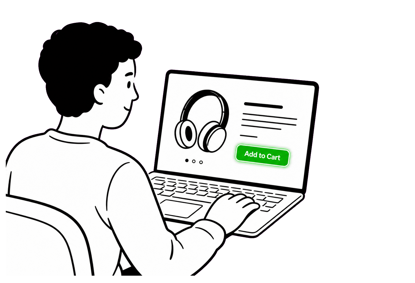
Every few weeks a founder shows us a beautiful website that doesn't convert, and the diagnosis is almost always the same. The site describes the product. It doesn't sell the change.
Visitors don't arrive wanting your product. They arrive with a problem, a sliver of attention, and a deep suspicion that your site will waste their time. Conversion is what happens when you beat that suspicion three times in a row: at the headline, at the proof, and at the ask.
The headline is a filter, not a slogan
A good headline doesn't try to be clever. It tells the right visitor, in their own words, that they're in the right place. The test we use: could a customer have said this sentence to a colleague? 'Unlock synergistic workflows' fails. 'Send invoices that get paid twice as fast' passes.
The fastest way to find that sentence isn't a brainstorm — it's sales calls and support tickets. Your customers have already written your headline; your job is to notice.
Proof beats promises, and specificity beats polish
After the headline earns a scroll, visitors look for a reason to believe. Generic testimonials ('Great team, great product!') are wallpaper. Specific outcomes ('Cut our onboarding time from 9 days to 2') are evidence.
Product screenshots are proof too — but only honest ones. A real interface with real data outperforms an idealized mockup, because visitors can sense when they're being shown a brochure instead of a product.
One page, one ask
The biggest conversion killer we see is hedging: three CTAs, side by side, all equally weighted. Book a demo. Start a trial. Talk to sales. When everything is the next step, nothing is.
Pick the single action that best matches a visitor's stage and make everything on the page roll downhill toward it. Secondary actions can exist, but visually they should know their place.
Speed is a feature of persuasion
None of this matters if the page takes four seconds to load. Performance isn't an engineering nicety — it's the first impression. A site that responds instantly feels like a product that works.
Our rule of thumb: if a page element doesn't help the visitor decide, it's costing you milliseconds and attention for nothing. Cut it, then cut once more.